Warm Neutrals Are Back
Published by Delve Interiors | 14 April 2026
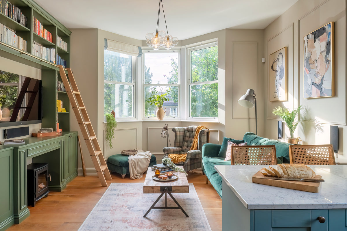
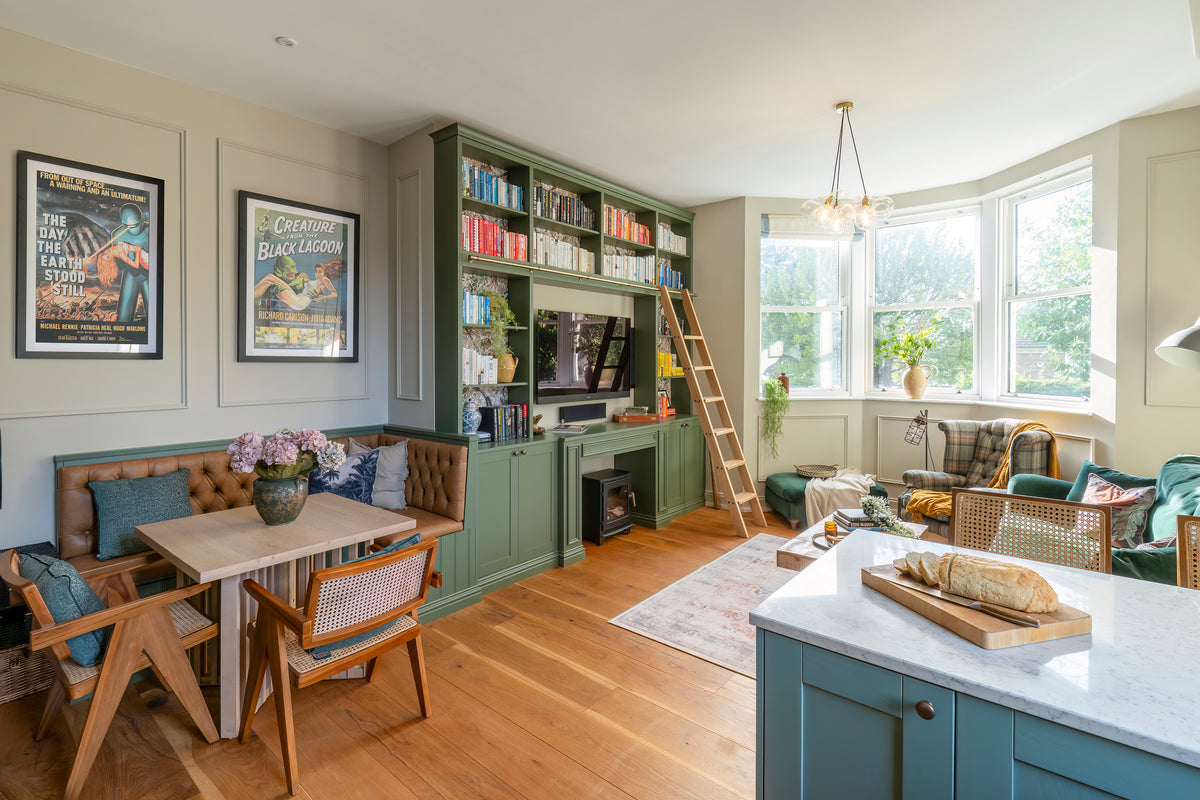
Warm neutrals in action: a living room in Kent by Delve Interiors
If you've spent the last few years painting everything in shades of cool grey, it might be time to put down the Dulux colour chart and rethink. The design world has spoken, and in 2026 warm neutrals are having a moment.
From the pages of Homes & Gardens to the mood boards at Milan Design Week, the message is clear: we're moving away from clinical, cool-toned interiors and leaning hard into colours that actually make a room feel like a hug. Picture a living room bathed in late-afternoon sunlight, where creamy off-white walls glow with warmth and a soft clay-coloured sofa sits piled with textured linen cushions in shades of oat and camel.
The Shift Away from Cool Greys
For the better part of a decade, grey dominated the UK interior scene. It was safe, it was modern, and it went with everything. Until, suddenly, it didn't. Designers are now calling time on flat greys and sterile whites. While those palettes photographed well, they often left rooms feeling cold and a touch impersonal, like walking into a show flat rather than someone's actual home.
The 2026 palette is its polar opposite. Interior designers are championing colours rooted in nature: sun-baked terracotta, soft linen, dusty sandstone, and warm mushroom. These are shades that shift beautifully throughout the day, glowing golden in the morning and deepening to a cosy amber in the evening.
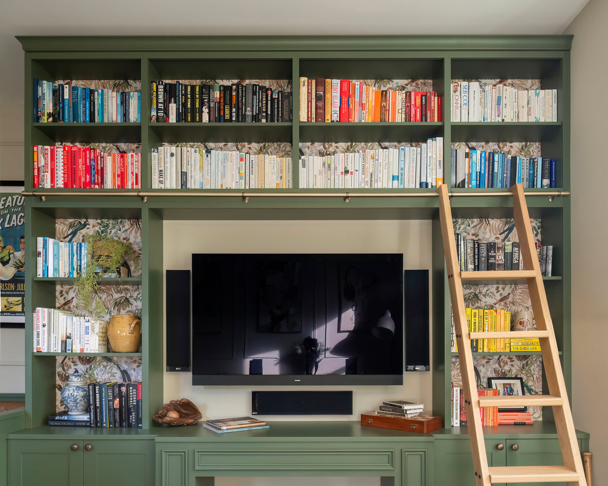
Warm neutrals paired with a nature inspired green bring this bespoke bookshelf area to life.
How to Introduce Warm Neutrals at Home
Start with Your Walls
The easiest entry point is paint. Benjamin Moore's 2026 Colour of the Year, Silhouette, is a sumptuous espresso brown that perfectly captures the mood. If that feels bold, try a softer clay or warm putty shade as your base, then layer darker accents through furniture and textiles.
Shop the look: A tin of Farrow & Ball's 'Setting Plaster' is a gorgeous starting point. It's a dusty pink-beige that shifts from blush in bright light to a warm stone in the evening, making it endlessly versatile.
Layer with Textiles
Warm neutrals truly come alive when you layer textures. A deep linen sofa in soft camel, draped with a chunky oatmeal wool throw would work beautifully. Scatter a few cushions in varying tones, from pale cream to rich toffee, and suddenly a simple neutral scheme has depth, warmth, and real personality.
Shop the look: This pink heritage style throw adds instant warmth to any sofa. I Also love this natural jute rug for grounding a living room.
Furniture in Warm Wood Tones
Cool-toned furniture like bleached oak and pale ash is making way for richer, warmer woods. Such as a beautiful walnut coffee table with its swirling grain or a smoked oak bookshelf lined with well-loved books and a few ceramic pieces in earthy tones. Walnut, smoked oak, and even burl wood finishes are everywhere right now. Ideal Home recently highlighted how high-street brands like Dunelm are making these finishes accessible, so you don't need a designer budget to get the look.
Shop the look: This walnut effect side table is a brilliant affordable update.
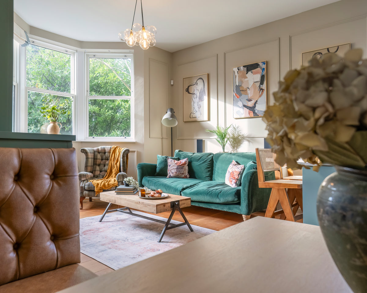
Warm neutrals create a restful, cocooning retreat
The Colour Combinations to Try
Warm neutrals don't mean playing it safe. The most exciting interiors right now are pairing these softer base tones with unexpected accents. Here's what the magazines are loving:
Clay + Olive Green: An earthy, grounded combination that feels both modern and timeless.
Caramel + Dusty Rose: Soft and romantic without being saccharine.
Mushroom + Deep Burgundy: For those who want warmth with a little drama.
Beauty edit: That golden-hour glow works on skin and hair, too. A few drops of OLAPLEX Nº.7 Bonding Oil gives hair a warm, candlelit shine, while Skin + Me's Daily Moisturiser with SPF50 keeps skin dewy and protected all day.
Why This Trend Has Staying Power
What makes warm neutrals more than just a passing fancy? It comes down to how they make us feel. As House Beautiful noted in their 2026 trend report, the move towards warmer palettes reflects a broader cultural shift towards designing for wellbeing. After years of prioritising aesthetics over comfort, homeowners are choosing spaces that feel nurturing, personal, and liveable.
The beauty of warm neutrals is their versatility. They work in a country cottage just as well as a city flat. They play nicely with both modern and traditional furniture. And unlike statement colours that can date quickly, a warm neutral base will carry you through multiple trend cycles. You simply update the accents.
The beauty of warm neutrals: they only get better with time
The Delve Interiors Take
At Delve Interiors, we've been championing warm, personality-led spaces for many years. If you're thinking about refreshing your home this spring, a warm neutral palette is a classic and will not date any time soon.